Hello
This is WPF Contextmenu...
I have a question about reducing the margins on the menu.
I want to reduce the margin of ItemsPresenter to (0,0,0,0)
View attachment 3381
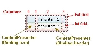
To explain in more detail:
I want to reduce the margin of [ Int Grid ] to (0,0,0,0)
View attachment 3382
As you can see in the image above, the MenuItem is made of a grid with 4 columns. The first column is reserved for the Icon object, the second for the vertical separator and the third column contains the Header object. The fourth and last column serves as spacer.
Please Help me
Please Help Me.....
You want to remove the internal padding/margin that WPF's default MenuItem template applies, causing space around the icon and header content within each individual menu item, as shown by the [ Int Grid ] area in your diagram.
This space is typically added by a Border element within the MenuItem's default ControlTemplate, not directly on the ItemsPresenter (which is usually used for the
sub-menu items displayed in a popup) or the Grid itself.
To reduce this internal margin to (0,0,0,0), you need to override the default ControlTemplate for the MenuItem and set the Padding property of the main Border element within that template to 0.
Here's how you can do it:
- Get the Default ControlTemplate: The easiest way is to get the default template. You can find it online (search for "WPF MenuItem default style template") or extract it using tools like Visual Studio's XAML designer (right-click the control -> Edit Template -> Edit a Copy) or Snoop.
- Create a Style: Define a Style for MenuItem.
- Override the ControlTemplate: Set the Template property of the style using a Setter. Inside the Setter.Value, paste the copied default ControlTemplate.
- Modify the Padding: Locate the main Border element within the template. It often has a name like Border or similar and wraps the Grid containing the icon, header, etc. Change its Padding property from its default value to 0.
Here is an example of how the style would look (Note: This is a simplified structure; the actual default template is more complex, but the principle of finding the main Border and setting its Padding is correct):
XML
<Style TargetType="{x:Type MenuItem}">
<Setter Property="Template">
<Setter.Value>
<ControlTemplate TargetType="{x:Type MenuItem}">
<Border x:Name="Border"
Background="{TemplateBinding Background}"
BorderBrush="{TemplateBinding BorderBrush}"
BorderThickness="{TemplateBinding BorderThickness}"
SnapsToDevicePixels="true"
>
<Border.Padding>
<Thickness Left="0" Top="0" Right="0" Bottom="0"/>
</Border.Padding>
<Grid>
<Grid.ColumnDefinitions>
<ColumnDefinition Width="Auto"/>
<ColumnDefinition Width="Auto"/>
<ColumnDefinition Width="*"/>
<ColumnDefinition Width="Auto"/>
</Grid.ColumnDefinitions>
<ContentPresenter x:Name="Icon"
Grid.Column="0"
Margin="0" VerticalAlignment="Center"
SnapsToDevicePixels="{TemplateBinding SnapsToDevicePixels}"
Content="{TemplateBinding Icon}"
ContentSource="Icon"/>
<Border Grid.Column="1"
Width="1"
Margin="0" Background="Transparent"/> <ContentPresenter x:Name="HeaderHost"
Grid.Column="2"
ContentSource="Header"
RecognizesAccessKey="True"
Margin="0" VerticalAlignment="Center"
SnapsToDevicePixels="{TemplateBinding SnapsToDevicePixels}"/>
<ContentPresenter x:Name="RightArrow"
Grid.Column="3"
Margin="0" VerticalAlignment="Center"
ContentTemplate="{DynamicResource {x:Static MenuItem.RightArrowTemplateKey}}"/>
</Grid>
</Border>
<Popup x:Name="PART_Popup"
AllowsTransparency="true"
Focusable="false"
Placement="Right"
PopupAnimation="{DynamicResource {x:Static SystemParameters.MenuPopupAnimationKey}}"
IsOpen="{Binding IsSubmenuOpen, RelativeSource={RelativeSource TemplatedParent}}">
<Border x:Name="SubmenuBorder"
Background="{DynamicResource {x:Static SystemColors.MenuBackgroundBrushKey}}"
BorderBrush="{DynamicResource {x:Static SystemColors.MenuBorderBrushKey}}"
BorderThickness="1">
<Border.Padding>
<Thickness Left="0" Top="0" Right="0" Bottom="0"/>
</Border.Padding>
<ItemsPresenter x:Name="ItemsPresenter"
KeyboardNavigation.DirectionalNavigation="Cycle"
KeyboardNavigation.Target="{Binding RelativeSource={RelativeSource Self}}"
SnapsToDevicePixels="{TemplateBinding SnapsToDevicePixels}"/>
</Border>
</Popup>
</ControlTemplate>
</Setter.Value>
</Setter>
</Style>
How to Use:
- Place this Style definition in your application's resources (App.xaml), a window's resources, or a resource dictionary.
- If you place it in App.xaml or a merged resource dictionary without an x:Key, it will apply to all MenuItem elements in your application.
- If you give it an x:Key (e.g., <Style x:Key="NoPaddingMenuItemStyle" TargetType="{x:Type MenuItem}">), you must apply it explicitly to each MenuItem like this: <MenuItem Header="File" Style="{StaticResource NoPaddingMenuItemStyle}"/>.
By setting the Padding of the main Border in the template to 0, you remove the space between the Border's edge and the internal Grid, effectively making the [ Int Grid ] area fill the entire clickable space within the MenuItem. You may also want to ensure the Margin properties on the ContentPresenters for the Icon, Header, and RightArrow within the template are set to 0 if they have any default non-zero values. The example above shows setting these Margins to 0 as well for completeness.
Remember to use the full, accurate default ControlTemplate for your specific WPF version or theme when implementing this. The simplified example is just to show where the Padding property needs to be changed.

