Question Need advice how better to program custom bar chart

Rost

Member
Joined
Feb 5, 2023
Messages
7
Programming Experience
Beginner
Hello.

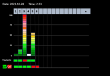
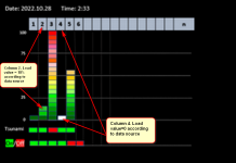
I am very new in C# and I need to make a monitoring system, that will show bars according to the table (from csv file that updated every minute). Example of the data that represented on attached picture:

2022.10.28 2:33
1 33 5 0
2 33 18 0
3 33 100 1
4 33 0 0
5 21 55 0
6

Could you please advise how better to perform this kind of bars (not so standard for charts, as it comprise of rectangular pieces each represents 5% of load). What libraries and what kind of techniques should I use to make it happen? I would appreciate to point me in the right direction, to give me links or even to create a prototype of the code if it is possible. So, that I will be able to work further and make it perfect. I will be glad to buy a cup of coffee to a consultant. Thank you in advance for your help.

Rost
 

Attachments

  • Picture23.png
    Picture23.png
    16.1 KB · Views: 13
So are only the first and third columns of the table significant for creating the bar chart How are the second and fourth columns represented on the chart?

What problems are you running into trying to draw the chart? Seems pretty straight forward.
 
This picture is example from specification. There is no code yet. All columns are significant and all columns should be represented by bar chart. The chart may consist many columns, 25, or 48, or even 100. Main value of each column is % of load from 0 to 100%.
My question is what tool is better to use in C# to build this bar chart representation. For example, right now I am reading WPF's DataGrid. How good is this class to build what I want?

"What problems are you running into trying to draw the chart?" - Problem is - I do not know how to build it.
"Seems pretty straight forward." - straight forward by which tool?
 
Where are the second and fourth columns presented in that bar chart?

The DataGrid is for showing tabular data, not charts.

"Seems pretty straight forward." - straight forward by which tool?
Using graphics primitives like drawing rectangles. Recall that one of the common programming assignments given to students as they learn how to program is to produce bar graphs (often with just console UI).

Despite what Microsoft used to tell people back in the late 90's and early 2000's, and what UI control vendors latched on to, you don't always have to use X control or Y control. You could draw it yourself. That is all that their controls do anyway.

Anyway, if you must absolutely use someone else's control because "ain't got no time to do that chart programming", then good luck with your search. I'm quite sure that you will likely find a UI control vendor willing to sell you something, or an open source library that will have a bar chart close to that style.
 
Last edited:
Where are the second and fourth columns presented in that bar chart?

The DataGrid is for showing tabular data, not charts.


Using graphics primitives like drawing rectangles. Recall that one of the common programming assignments given to students as they learn how to program is to produce bar graphs (often with just console UI).

Despite what Microsoft used to tell people back in the late 90's and early 2000's, and what UI control vendors latched on to, you don't always have to use X control or Y control. You could draw it yourself. That all that their controls do anyway.

Anyway, if you must absolutely use someone else's control because "ain't got no time to do that chart programming", then good luck with your search. I'm quite sure that you will likely find a UI control vendor willing to sell you something, or an open source library that will have a bar chart close to that style.

Second and fourth columns are shown on the picture attached. Thank you for your answer.
 

Attachments

  • Picture23-1.png
    Picture23-1.png
    194.8 KB · Views: 8
Is there a way of building a prototype of the code so, that I will be able to work further and make it perfect? Who can do it and how much it can cost? Thank you.
 
Second and fourth columns are shown on the picture attached. Thank you for your answer.

Those are the second and fourth rows. I was asking about the second and fourth columns. Eg. the values: 33, 33, 33, 33, 21 for the second column and the values 0, 0, 1, 0, 0 for the fourth column.
 
Last edited:
Those are the second and fourth rows. I was asking about the second and fourth columns. Eg. the values: 33, 33, 33, 33, 21 for the second column and the values 0, 0, 1, 0, 0 for the fourth column.

Oh, got it. Second column - time - minutes when record was created. If difference more than given minutes (eg. 5) from time of file modified, then the lowest element of the bar is indicating Off - red. Fourth column - Tsunami. 1 - red - Tsunami on the market )).
 
These bars built using DataGrid. Could you suggest how can I get horizontal lines at the levels of 0, 25, 50, 75 ?
 

Attachments

  • Picture-10.png
    Picture-10.png
    30.7 KB · Views: 12
How did you put in the vertical lines? You would do the same thing.

I still think you are using the wrong tool for the job, but if you are making progress with it, more power to you.
 
'Nasty' )) Could you show how should it be done? I have asked above about such possibility: 'building a prototype of the code so, that I will be able to work further and make it perfect? Who can do it and how much it can cost? Thank you.'
 
"Should" is somewhat subjective.

Were it my money I would probably paint it myself rather than have a datagrid draw it by setting different cells different colors, mainly because it's a reasonable bet that at some point one would have to dip into painting parts of the grid manually anyway, to achieve some otherwise impossible functionality.

It's like being at that point one usually wishes that, even though a rock was the thing one had to hand when they needed a hammer, when the rock has finally split after driving its 25th nail and gashed one's hand, taking 30 mins out to go and buy a hammer would be the overall better solution. The sooner one goes to it, the sooner one exits the sunk cost fallacy
 
But there is also the ramp up time to learn how to use a hammer properly. Can't choke up on the handle and effectively use the hammer like a rock.
 
Back
Top Bottom